projects
Below are a variety of projects—spanning professional, academic, and personal work—that reflect my skills in geospatial and data analysis, coding, research, and writing.
“mapping a greener future”
I’m pleased to say that a brief article I was the lead author on has been published in Urban Agriculture Magazine, a publication of the Resource Centres on Urban Agriculture and Food Security. The article, titled “Mapping a greener future: how GIS enhances urban agriculture initiatives”, appears in issue no. 41, released in July of 2024. The article is a summary of the work I am a part of as a member of the Urban Land Evaluation and Site Assessment (uLESA) research team at VCU that is working to enhance empiricism and intentional planning around site selection for urban agriculture initiatives. The article discusses the critical role of GIS in identifying optimal locations for in-ground urban agriculture projects, the development of web applications for decision-making, and the importance of social equity and sustainability in these initiatives.
The above gif is a quick demo of the application I developed using ArcGIS Experience Builder as a deliverable for the Richmond uLESA project. The app allows users to explore the city of Richmond, VA in conjunction with various data layers, including the Richmond uLESA model output, which highlights optimal sites for urban agriculture based on a number of geographic, environmental, and social equity-focused variables, the city’s parcel layer, existing community gardens, neighborhood boundaries, and council districts.
climate change effects on Virginia reservoirs
I recently finished up a project with the Bukaveckas Lab at VCU that involved analyzing long-term water temperature and dissolved oxygen trends in Virginia reservoirs to assess the effects of climate change. This involved carrying out median-based linear modeling (MBLM) to assess trends at 41 lake stations across the state. MBLM was selected for its robustness to outliers, which ensured more reliable results in the presence of irregular data points, occurring either as a result of extreme weather conditions or instrument error. The analysis was based on a large data set from Virginia Department of Environmental Quality comprising ~19,00 profiles from over 500 stations across more than 100 reservoirs in the state. The stations selected for the study were chosen based on their having at least 100 profiles available for analysis. For each station, I derived month-by-month trends from May to October, along with intra-annual trends focusing on the period from April to August of each year.
I really enjoyed this project, not only because it gave me a chance
to learn about and apply a new statistical method in the context of
valuable climate-focused research, but because it presented me with some
opportunities for data visualization and applying my GIS and spatial
analysis chops. Exploratory analysis involved, among other things,
testing various environmental factors, such as latitude, longitude, to
uncover potential spatial gradients and temporal patterns that might
explain variability in the data. I had a rewarding - if rather
challenging - experience trying to create a plot, using our data, based
on a figure from another publication. This involved some pretty advanced
ggplot2 concepts to achieve the desired formatting and
layout. Plus, I got to make a cool map, for use in the forthcoming
publication, that shows the locations of the trend analysis sites and
the watersheds they are located in. This gave me a chance to try to put
togethre a compelling color scheme and layout that was be both visually
appealing and informative.
All in all, this project is built on quite a few Markdown files. Below are a couple of examples.
- source code for deriving DO trends and producing corresponding box-whisker plots
- source code for deriving Apr to Aug site trends + generating plot
eBird life list database
leveraging PostgreSQL and PostGIS for geospatial data management
This was a fun personal project based around my eBird life list. While the project admittedly has an air of data navel-gazing, my goal was to practice implementing a spatial database using PostgreSQL with PostGIS, host it on a server, and develop a functional application that interacts with the database.
I first worked out the database structure and schema using
dbdiagram.io (see image above). I then used R to prepare the data tables
that would make up the database and utilized the RPostgres
and DBI packages to execute SQL commands directly within
the R environment. I made use of the pgAdmin GUI for setting up an
instance on Amazon Web Services RDS, then executed the actual import of
the database backup .sql file via the command line. The process was a
bit of a challenge, but rewarding, as it tested my ability to integrate
various tools, methods, and platforms.
To enrich the database and flesh out the tables with additional
information, I worked with some cool packages in R. Specifically, I used
rebird for accessing eBird data and openmeteo
to pull in weather data. rebird provides some great
functionality, but there is no direct way to access individual eBird
checklist attributes, some of which I needed (e.g, time, outing
duration, total number of species seen) in order to achieve my desired
database schema. To work around this, I created a custom function to
make an API call and return a given checklist’s attributes as a list
object that could be teased apart. Another challenge that required some
creative problem solving was deriving spatial coordinates from
observation locations that weren’t tied to recognized hotspots. I took a
two-pronged approach, first leveraging regular expressions for
extracting coordinates embedded in location names, and then relying on
manual data entry for coordinates not available through programmatic
means. The project is still ongoing, and when time permits I will work
on building out a Shiny application to interact with database.
colima warbler species range
using spatial landscape variables to better understand distribution

Colima Warbler (Leiothlypis crissalis) is a migratory songbird whose breeding habitat is limited to parts of the rugged, mountainous terrain of Mexico’s Sierra Madre Occidental and the Chisos Mountains of Big Bend National Park. Range maps for this species tend to significantly overstate its extant distribution within the United States. To get a sense of species’ ‘official’ range, check out the map I created below, based on the distributions recognized by the United States Geological Survey and BirdLife International.
Breeding birds have been shown to inhabit areas dominated by oak, pinyon, juniper, and Arizona cypress, and demonstrate a clear preference for elevations above 1,500 m, with individuals most frequently observed at elevations ≥ 1,800 m. They employ a ground-nesting strategy and prefers steep (≥35°), north-facing slopes, and sites that are shaded from direct sunlight for 70% of daylight hours.
I used these attributes to derive a model of probable species distribution within the US that radically reduces the area of likely occurrence as compared with the official USGS species range polygon. The project primarily involved raster analysis: deriving slope and aspect from digital elevation models, extracting raster cells based on specified attributes and mask polygons, reclassifying cells to standardized values, and overlaying raster layers to calculte the sum of their cells.

Colima Warbler range based on BirdLife International’s
species range map.
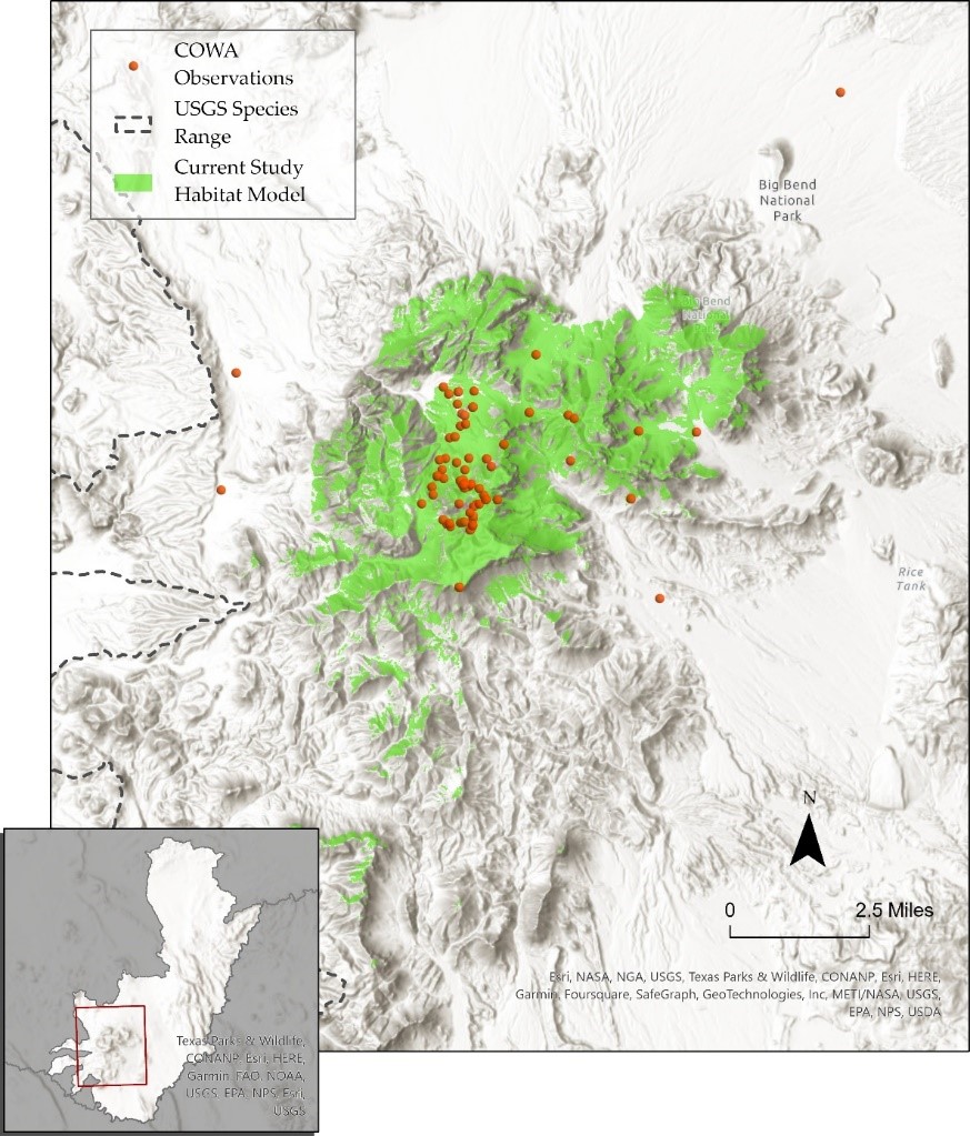
Extent of all reported COWA observations within the United States across all years. Data obtained from eBird and iNaturalist. Inset map reflects model extent within existing USGS range polygon.
urban tree inventory
laying the foundation for a comprehensive tree inventory system
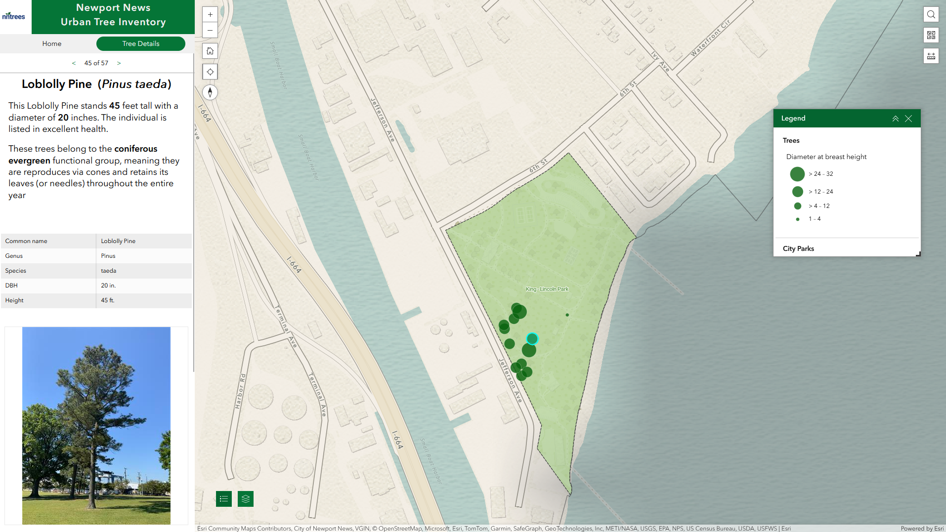
While working with the City of Newport News GIS team, I was tasked with developing a tree inventory system that could be used to support the city’s sustainability and resource conservation goals and facilitate more efficient and modernized tree care management. The project involved creating a spatial database in ArcGIS Online to manage tree data, building out a Field Maps application for tree data collection, integrating USDA’s i-Tree Eco workflow for calculating ecosystem benefits, and developing an application using Experience Builder that could be used to explore the city’s trees and interact with the collected data.
In addition to the main ‘Trees’ point layer, I incorporated a functionally related reference table into the ‘City Trees’ feature layer When a user selects a common name in the Field Maps app, the app utilizes Arcade expressions to cross-reference the table for a matching common name. It then automatically populates the fields ‘species’, ‘genus’, ‘functional group’, and ‘native’ within the app based on the retrieved data.
I was able to to leverage Python using Jupyter Notebooks in ArcGIS Pro in order to automate some important data management processes. One notebook assigns unique tree identifiers to each tree. By default, every new tree entry in the database is automatically assigned a long, alphanumeric Global ID. For day-to-day operations and easy reference, this identifier is not practical. Something shorter and more intuitive was needed. So, instead of a 36 character alphanumeric string, each tree is assigned a unique ID of the form, e.g., ’NNTREE-10`. I created another Notebook to handle the renaming of fields in the data set returned by i-Tree. The process of getting ecosystem services and benefits calculated by i-Tree involves importing your collected field data and sending it off to the i-Tree web application. The data is then processed and returned as a CSV file. Unfortunately, the returned field names are not consistent with database best practices (e.g., they contain spaces and special characters).The script ensures that these field names are renamed in accordance with the established tree database schema.
As of this writing (May 2024), the tree inventory project is still in its nascent stage, and as a result the application I built is not publicly available. But you can see a short video demo of the application below.
visualizing water temperature over time
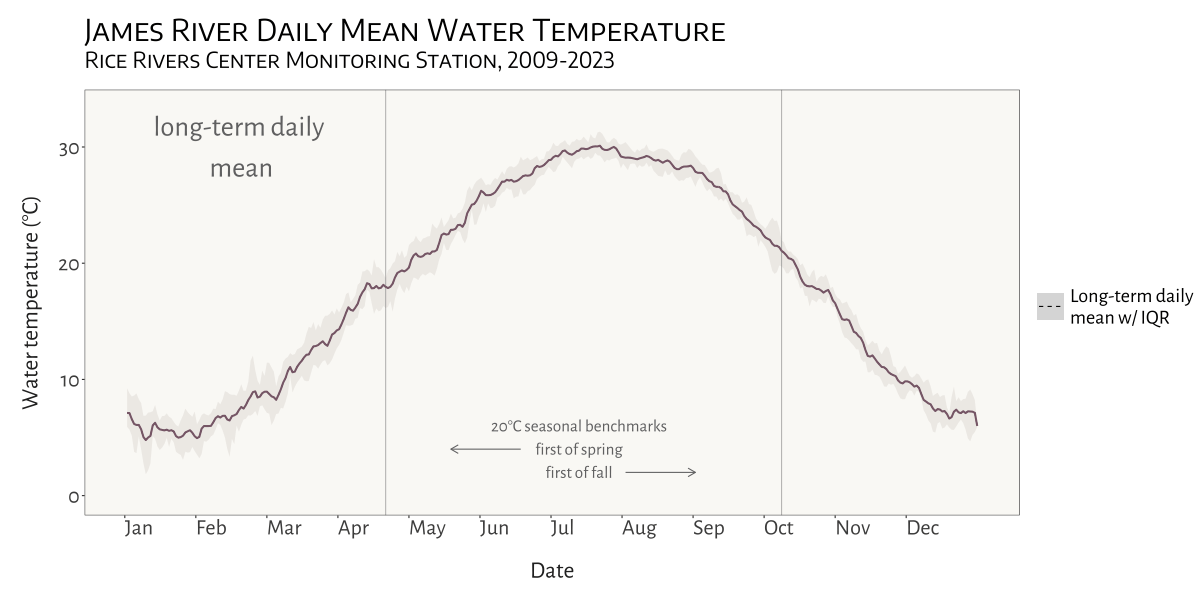
In the Spring of 2024 I was asked to see if I could create a dynamic, animated visualization to depict seasonal patterns and inter-annual variation in water temperature at VCU’s Rice River Center monitoring station on the James River.
This involved first combining 15 years of water quality monitoring data to generate daily mean summary statistics for select variables. Quite a bit of wrangling and problem solving were required to get from A to B. I made extensive use of nested list structures to organize and manage the data, which allowed me to systematically separate and categorize data by year and tab across and within Excel workbook files. This was critical given the inconsistency in the data schema and variable naming conventions over the 15 years that data were collected.
I was already familiar with R’s ggplot2 before beginning
this project, but the need for a dynamic plot gave me the chance to
explore the gganimate package - something I look forward to
doing more of in the future!
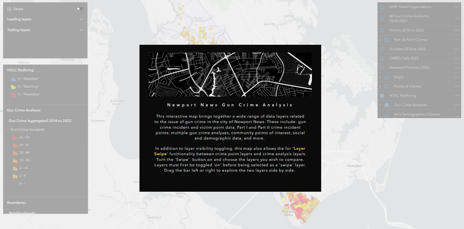
mapping gun crime
aggregating urban gun crime incidents to reveal spatial patterns
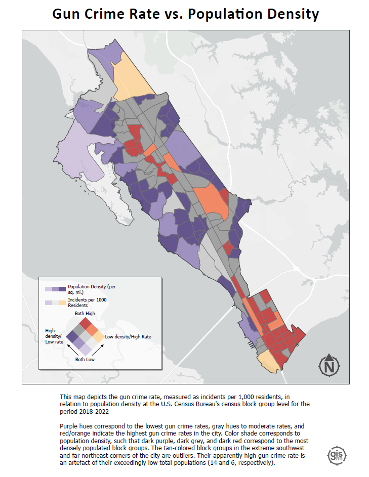
A significant part of my time working with the City of Newport News GIS team involved processing, geocoding, mapping, and analyzing five years (2018-2022) worth of gun crime data as part of the city’s Gun Violence Intervention Program.
Given the size and complexity of the data sets received from the Newport News Police Department, a good bit of wrangling was required to prepare them to be mapped and analyzed. Because this project was carried out with the intention of being able to re-run the analysis in the future as new data is receied, I developed a script in R to streamline the data preprocessing tasks. This automation not only facilitated the initial data preparation but also ensured the project’s adaptability and longevity. Once prepared, I utilized ArcGIS Pro for geocoding, mapping, and subsequent analysis.
I employed a variety of analyses and visualization techniques to better understand the spatial patterns underlying gun crime in the city, each of which were used in a presentation to city officials, decision makers and community leaders in the fall of 2023.
Bivariate Choropleth (Population Density vs. Incident Rate): This map combines two key variables—population density and gun crime incident rate—into a single visualization. By doing so, it indicates how the frequency of gun crimes correlates with the concentration of people across different areas.
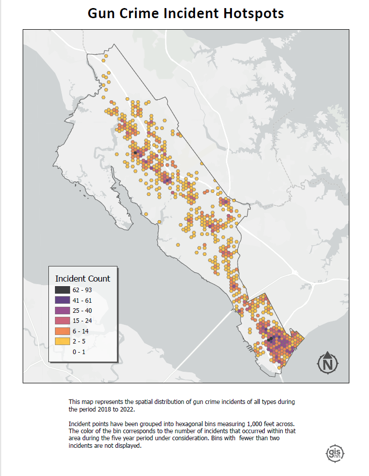
Hotspots: This visualization identifies geographical areas with significantly higher occurrences of gun crimes by aggregating points into hexagonal bins 1,000 ft. across.
Hot Streets: Similar to the hotspots map but more specific. This map pinpoints street segments with high frequencies of gun crime.
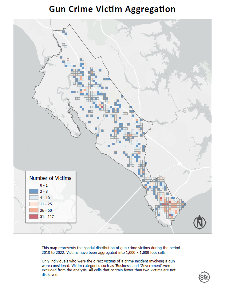
Victim Binning: This map displays the spatial distribution of gun crime victims, with victims aggregated into 1,000 x 1,000 foot cells. It focuses exclusively on individuals directly affected by gun crime incidents, explicitly excluding victim categories such as ‘Business’ and ‘Government’ from the analysis. I employed a threshold to enhance clarity and focus, where only cells containing two or more victims are visualized.
Click on a layout below to see it as a high resolution pdf.
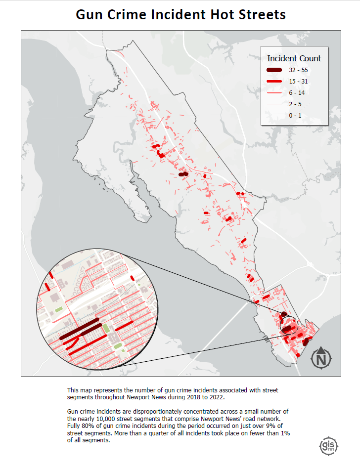
I found the hot streets analysis especially insightful. By combining the derived gun crime point layer with the city’s street centerline layer, I was able to identify street segments with the highest density of gun crime incidents by assigning each point to the nearest feature.
The result? Of nearly 10,000 street segments that comprise Newport News’ road network fully 80% of incidents occurred on just over 9% of those segments. More than a quarter of all incidents took place on fewer than 1% of all segments. This analysis helped to highlight the spatial concentration of gun crime incidents in the city, and to identify areas where the city’s resources might be most effectively deployed
bird diversity in grassland vs forest ecosystems
class-level landscape metrics as predictors of avian species richness
For this analysis, completed as the final project for landscape ecology (ENVS 591) during the fall of 2023 at VCU, I was interested in exploring the extent to which class-level landscape metrics differ in their ability to explain variation in avian species richness (total # of different species) in grassland ecosystems versus forest ecosystems.
The whole project was carried out using R in
RStudio, and was a great opportunity to conduct a spatial analysis
outside of a point-and-click GIS environment. Not using ArcGIS Pro meant
not enjoying the convenience of ‘on-the-fly projection’, which required
me to be especially attentive to coordinate reference systems and
projections as I prepared spatial data from different sources for
analysis. I also became familiar with a number of great spatial R
packages and APIs, including mapview, terra,
sf, raster, FedData, and
landscapemetrics.
This project gave me a chance to work with data sets from the National Ecology Observatory Network (NEON), a comprehensive ecological monitoring program that collects standardized, high-quality data from diverse ecosystems across the United States.
Check out the maps below - which I made in R using the
mapview package - to see the NEON sites used in my
analysis.
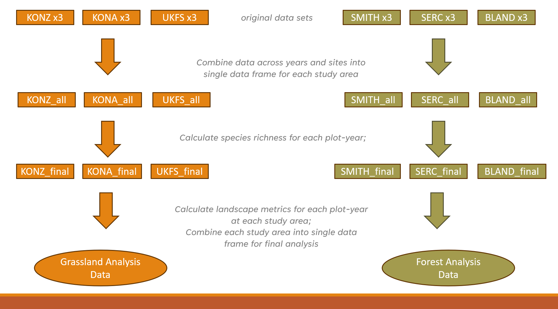
My analysis used three years of data (2019-2021) from three separate
study areas in each of the two landscape types. Study areas comprised
10-20 distinct study plots, with each ‘plot-year’ combination
representing a unique sampling event (n=228). For each plot-year, I
derived the total number of bird species observed. I pulled in National
Land Cover Data using FedData and generated buffers around
each plot-year at 200m, 500m, 1000m, and 2000m in order to assess the
influence of landscape metrics at different spatial scales.
Before calculating landscape metrics I first reclassified the NLCD
data using a reclassification matrix to produce new raster datasets with
simplified land cover categories (forest, agricultural, and urban). I
then used the landscapemetrics package to calculate 5
class-level metrics for each buffer size:
Five landscape metrics across four buffer sizes produced a total of
20 variables to be considered as potential predictors of species
richness in each ecosystem type. Given time constraints, I took a bit of
a shortcut to select variables for modelling. I utilized a tiered
hierarchical approach by applying the corSelect() function
from the fuzzySim package (v. 4.10.5). Minimally correlated
variables were first selected at each spatial extent and those selected
variables were then further evaluated together to make a final
selection. The approach was pragmatic, but I would like to eventually
return to this analysis and tailor variable selection by better
integrating domain-specific ecological knowledge.
With variables selected, I applied a generalized linear mixed model approach to incorporate study area as a random effect. This produced a ‘singular fit’, however, indicating that the model was overfitted – that is, the random effects structure was too complex to be supported by the data. Instead, I utilized multiple regression to fit models for every possible combination of predictor variable, then compared models using AIC to select the top performers and identify the most important predictors.
tl;dr version
- In mid-Atlantic forests, only elevation and % forest cover were found to be significant predictors of avian species richness.
- In grasslands, both PLAND at 1000m and AI at 1000m were found to be significant predictors.
- A significantly higher amount of variation in avian species richness was explained by grassland model (42.6%) than forest models (<12%).
Here’s a PDF version of a presentation that gives a more detailed look at some of the results.
gun data preprocessing automation
The urban gun crime work that I did during my time as a member of the City of Newport News GIS team gave me the chance to carry out some interesting spatial analyses and work on developing several apps with the Esri tool kit, including Experience Builder, Dashboards, and web maps (none of which are public-facing, unfortunately). But in order to get to that point, the data generated from the police department’s record management system query first needed substantial massaging and preparation.
To accommodate the need for re-running analyses and updating the dashboard annually or semi-annually with new data, I developed a script to automate the otherwise laborious task of preprocessing the raw RMS query outputs. I wrote the script in a heavily annotated R Markdown file, so that future users can easily interact with it using RStudio’s ‘visual’ mode and execute the code with little to no knowledge of R required. The user needs only to define two variables: a new folder name and the path of the Excel workbook file containing the raw data. The script takes care of the rest. The end result is two CSV files ready to be brought into ArcGIS Pro and geocoded.
modelling estuarine algal blooms
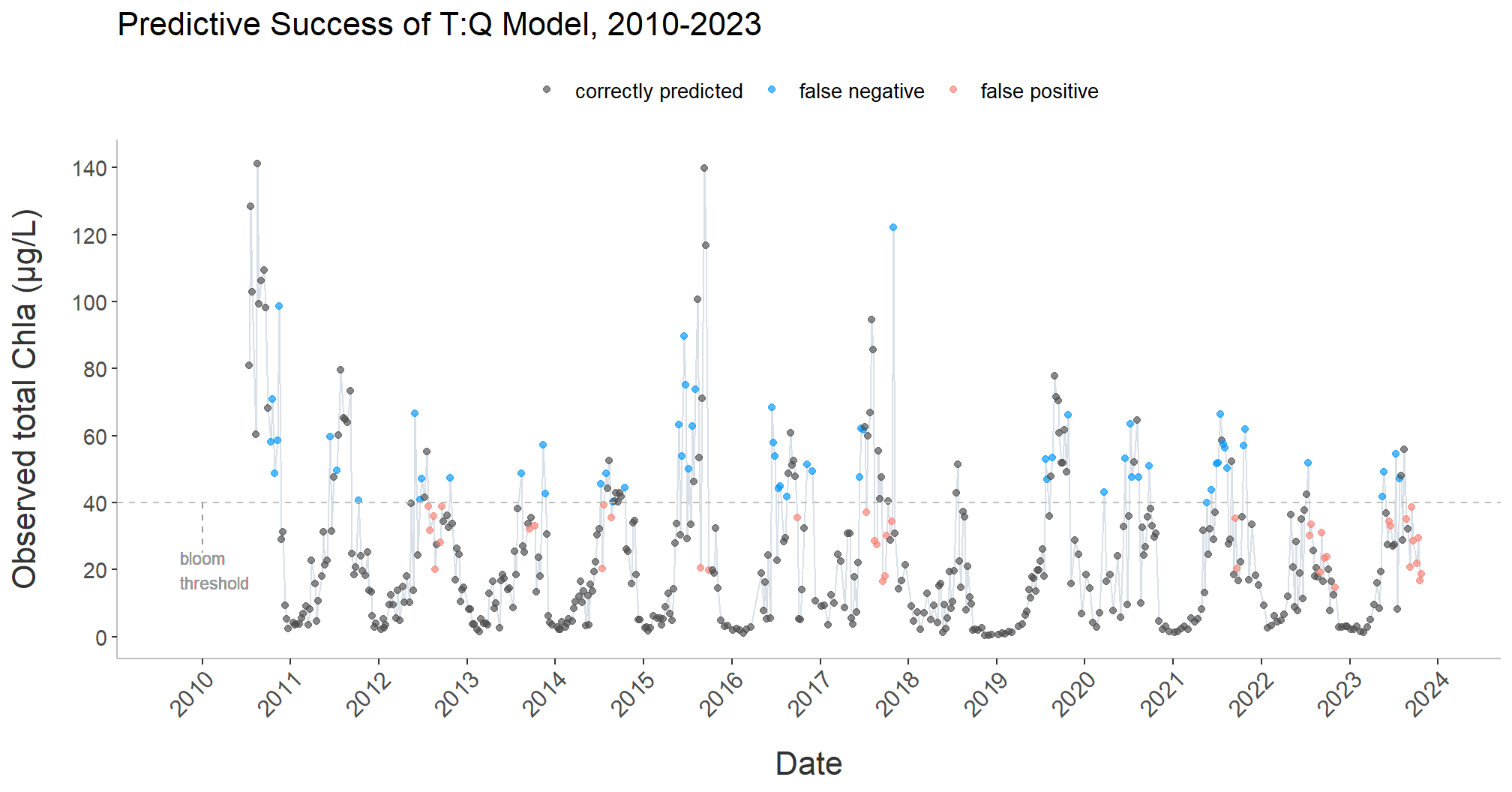
I’ve been fortunate to be able to provide water quality research assistance to the Bukaveckas Lab at Virginia Commonwealth University, in the form of program scripting, data analysis, and data visualization, since December of 2023.
Among other projects, I developed a script to facilitate the longitudinal analysis and modeling of chlorophyll a (CHLa) levels in the James River using multiple linear and nonlinear approaches.
The knitted HTML output contains tables with summary statistics for the all years in the data set; regression statistics for all years combined, as well as individual years, by model; model plots with best fit line; model-specific time series plots; and time series plots for CHLa and dissolved organic nitrogen.
The script is designed to dynamically adapt to changes in the dataset, accommodating new data from subsequent years without requiring manual updates to its structure or content.
More detailed program documenation is available on my Github page.
intro to osmdata
This was less a coding project and more a way to help folks in my office use some basic coding to programmatically access the OpenStreetMap database.
Newport News, VA has an amazing Geohub site, but - for obvious reasons - the city does not maintain spatial data layers on every feature that exists in the city. After a colleague shared in a meeting that she had to quickly put together a suitability analysis using features that she pulled in from multiple sources around the web - e.g., shopping, grocery stores, cinemas, bowling alleys, and sundry other sites for leisure activities - it occurred to me that the GIS team could benefit from being able to leverage the OpenStreetMap API in this sort of situation, should it arise again in the future.
I created a tutorial, adapting from this
excellent
and more comphrensive vignette on the CRAN website, for using
R’s osmdata package. It is written with the goal that
someone who had never used R or RStudio before would nevertheless be
able to access the API, pull in the data they are looking for, and
export it as a JSON that they can pull into the ArcGIS Pro environment
for use in mapping and analysis.
saltmarsh sparrow habitat suitability
identifying potential overwintering habitat for an endangered migratory songbird
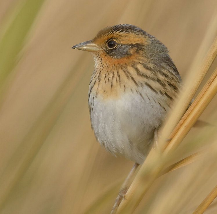
Saltmarsh Sparrow (Ammospiza caudacuta) perched on marsh reed. Photo credit: Mike Kilpatrick
This was the fist significant GIS project that I carried out independently, during the fall of 2022 at VCU. It required me to source, acquire, convert, and integrate diverse data sets to derive a habitat suitability index (HSI) for saltmarsh sparrow winter habitat in southeast Virginia - effectively the southern extent of their non-breeding range - in areas not already protected under a biodiversity or conservation mandate.
Confronted with the combined effects of sea-level rise and human coastline modification, the saltmarsh sparrow’s continued survival is by no means guaranteed. The North American Bird Conservation Initiative’s 2022 ‘State of the Birds’ report estimates that the species’ population has declined by more than half since 1970. The report anticipates a further 50% decline over the next half century. Similarly, researchers have demonstrated a staggering 9% annual rate of population decline since the mid-1990s. If that trend continues, they predict a collapse of the global population within 50 years, with as few as 500 individuals left by mid-century.
Saltmarsh sparrows demonstrate a strong affinity for high marsh vegetation. Research on migratory songbirds has demonstrated that occupying inadequate wintering habitat can affect the physical condition of birds during migration, their arrival date on nesting grounds, and their condition at breeding sites. Working to ensure access to high marsh throughout the entirety of the species’ range is therefore critical.
Generating the HSI required integrating vector and raster data from multiple sources, including the U.S. Geological Survey (USGS), eBird (Cornell Lab of Ornithology), the Protected Area Database (PAD), and the National Land Cover Database (NLCD). To read the full project report, including a more detailed discussion of analysis methods, click here.
I created the map below as part of an ArcGIS Story Map. It is here embedded as an ArcGIS Instant App. You can also click here to view in full screen as an ArcGIS Experience.
The map represents observations of Saltmarsh Sparrow during the breeding and non-breeding seasons since 2012. I pulled observation data into R using the eBird API, filtered by year and month, and brought the data into ArcGIS Pro to publish as a feature layer. You can click on the map to view it in full screen.